Compass Mobile Wireframing UI Kit
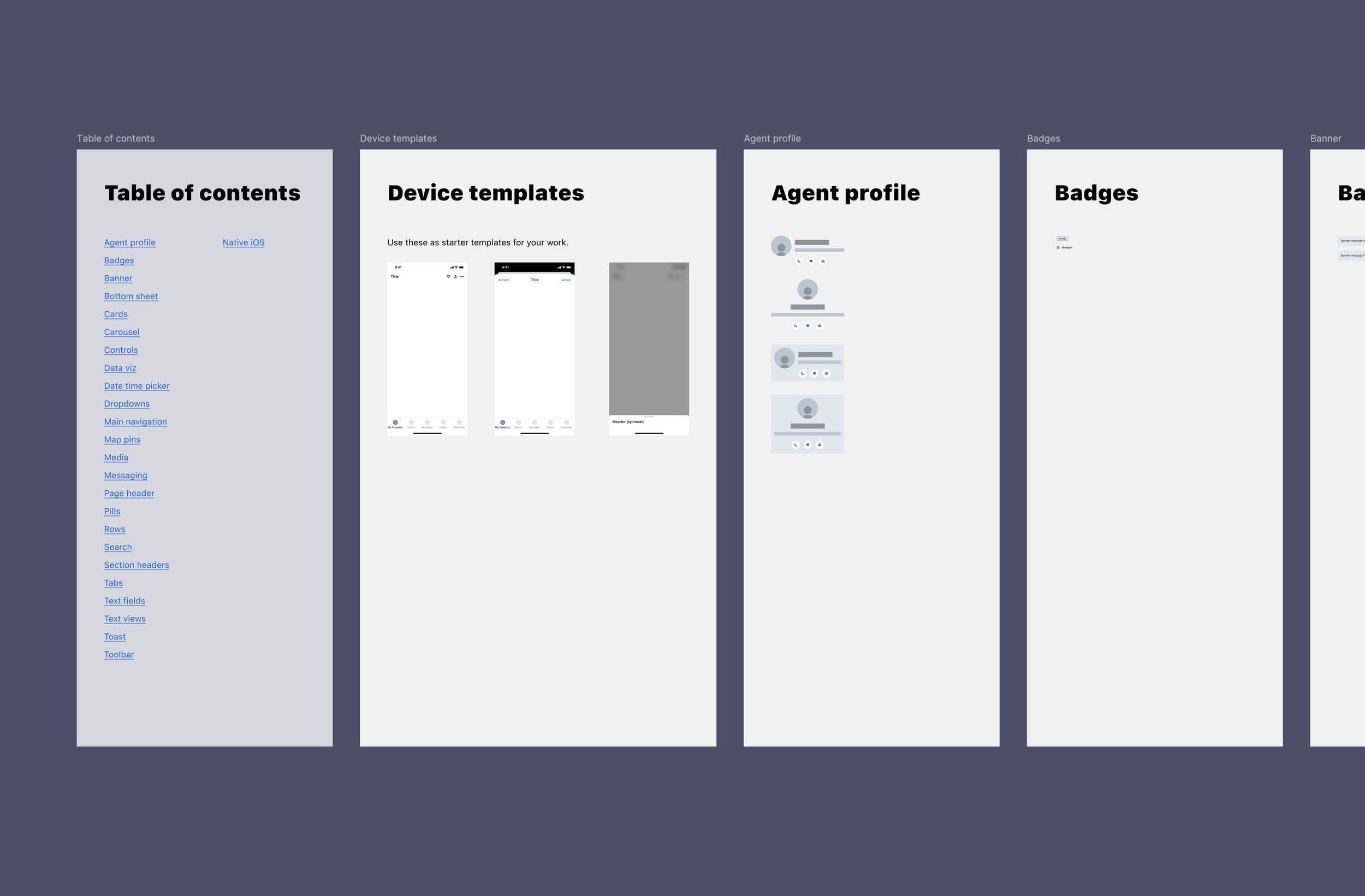
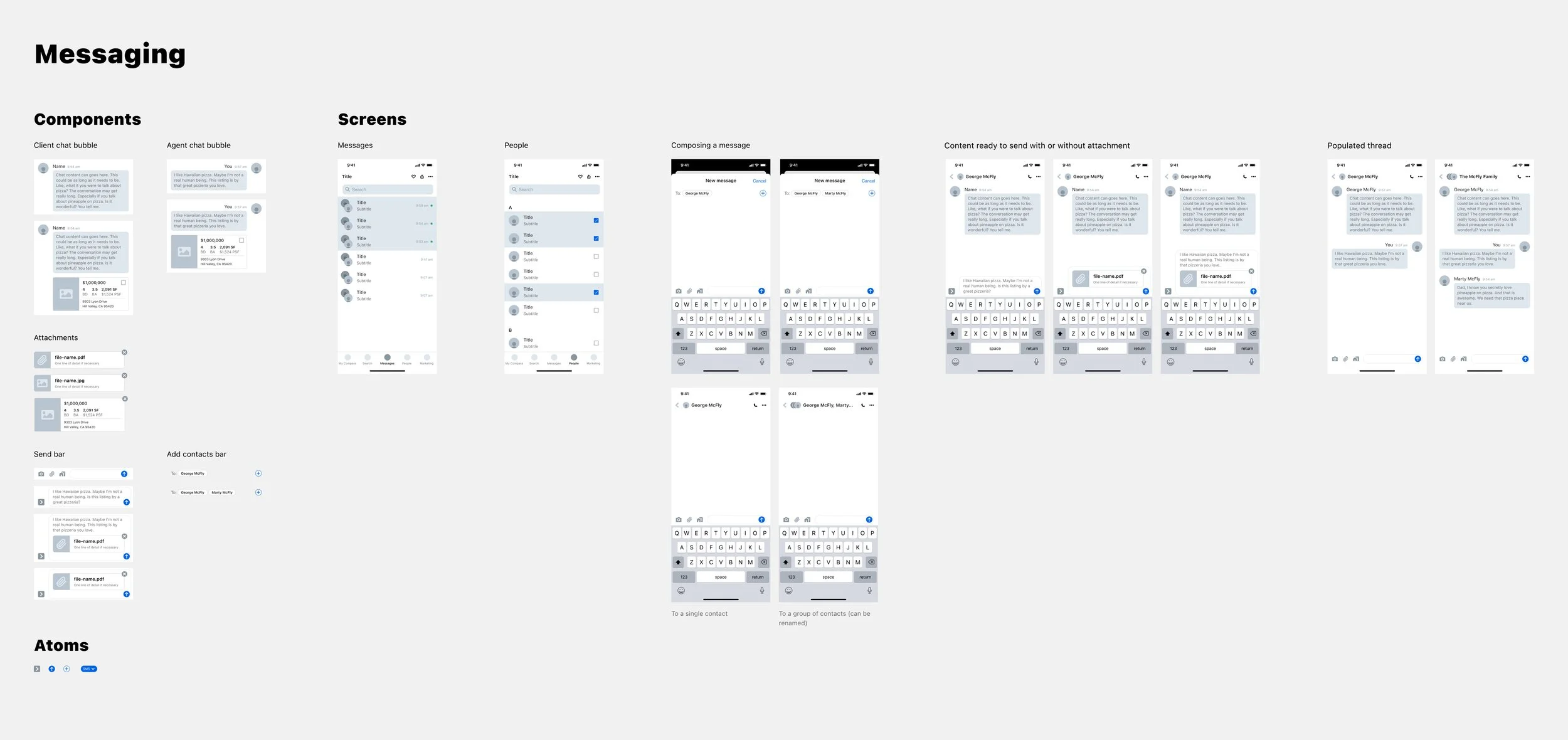
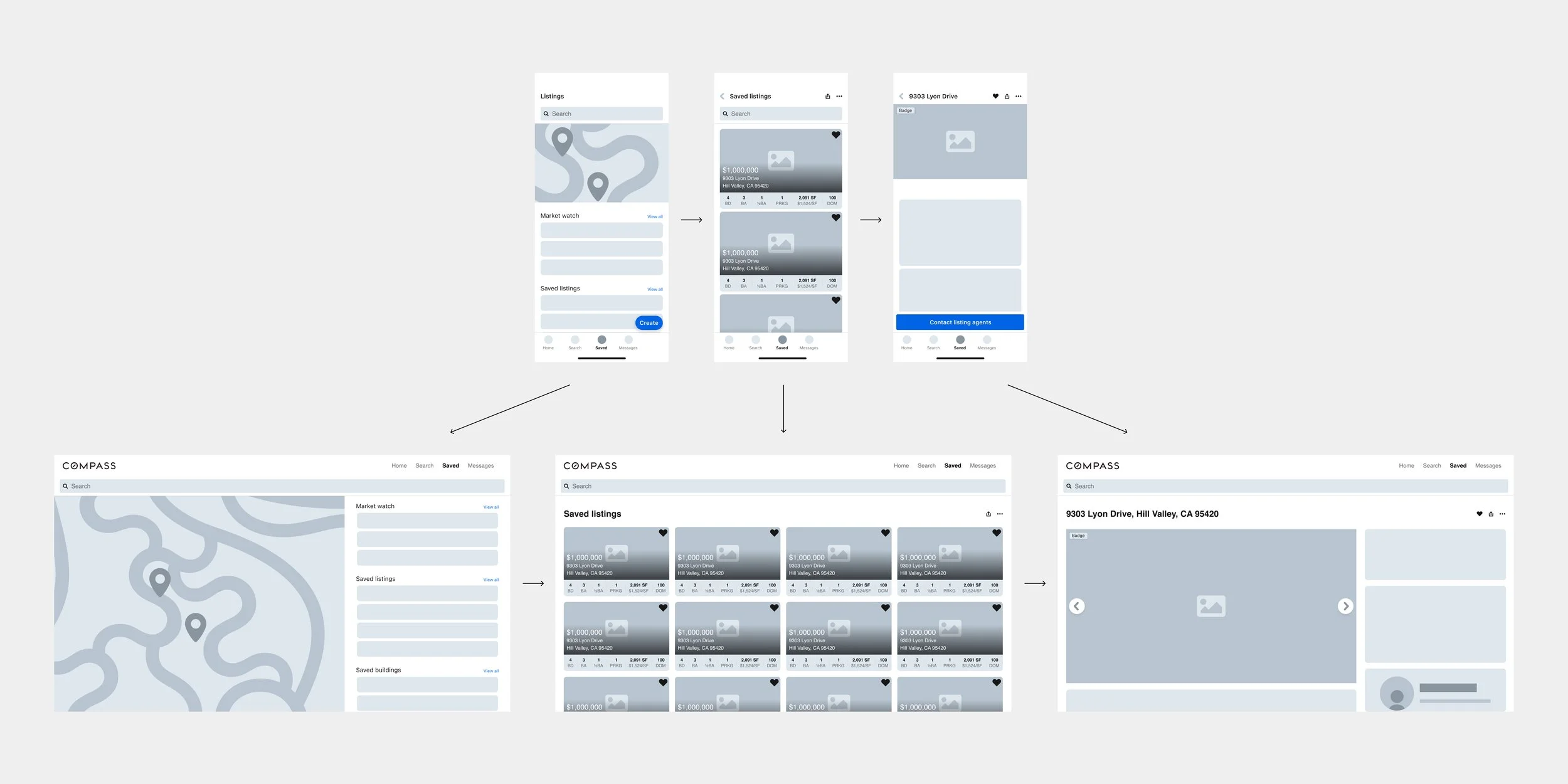
My design system team’s Design Director and I were tasked to find ways for the feature teams to create UX flows rapidly for a hackathon to redesign our mobile app. We decided to create a wireframing UI kit that mirrored a simplified version of our design system.
2021
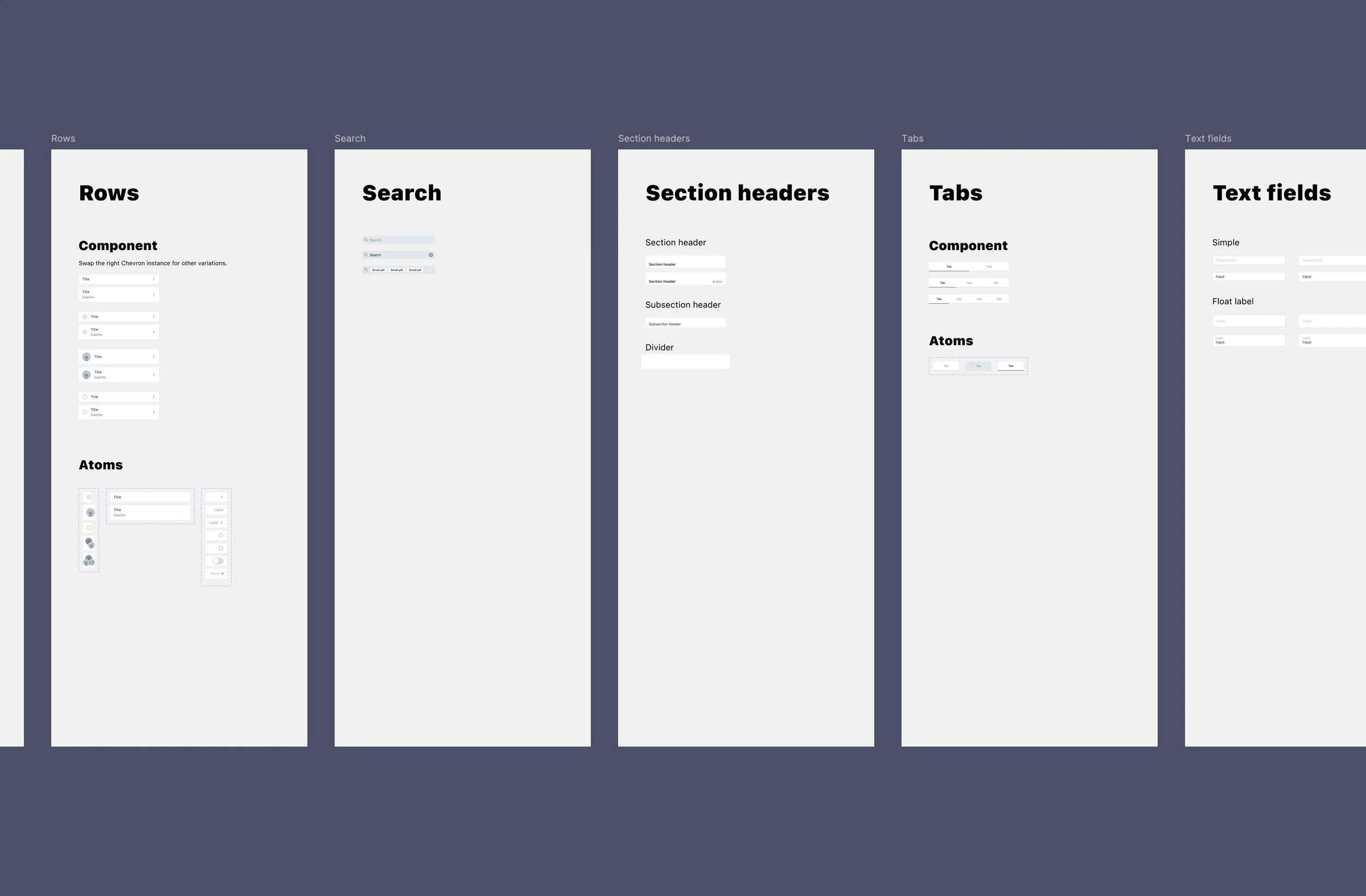
The key was to keep the elements and components uncomplicated so that the designers could focus on the information architecture. Additionally, the uniformity would allow the various teams to bring their flows together when necessary.
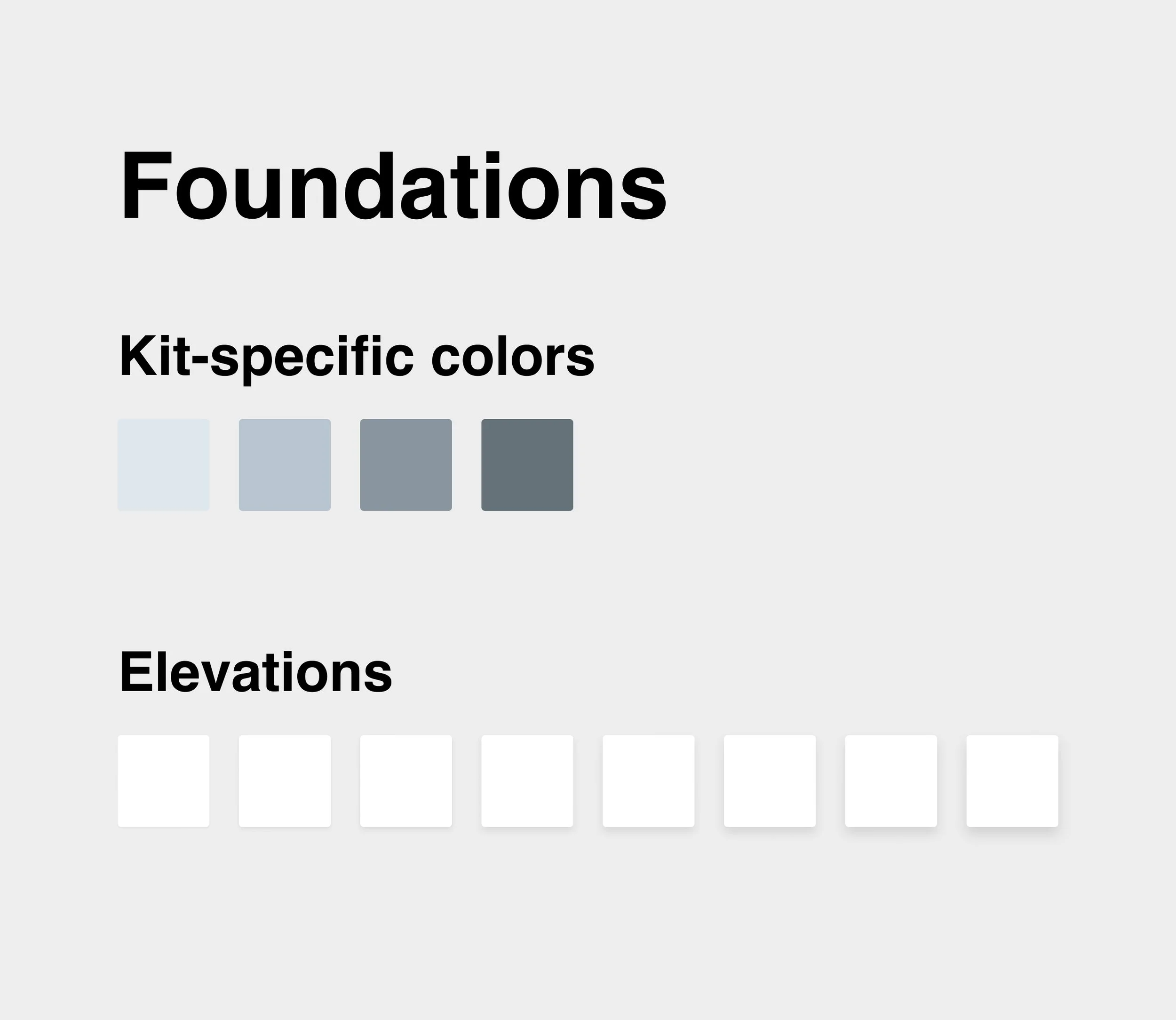
I looked at providing the very basics in the foundational level: colors and elevations. We used the iOS font family to prevent any focus on visual design. To make sure we’re not deviating from the familiar look and feel of Compass, I brought in pre-existing components of ours where it made sense and adopted the color palette of the UI kit.